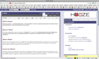
Great feedback everyone! We've tried out some changes — visible now at Hooze.org — and would love to hear more thoughts about our progress on some of these visual ideas. Please add your comments here:
This really rocks. I want it already on my own Wagn. Three tweaks that imho would make it even better: lighten the icons so that they're not so close in darkness to the background (they're so close now that it actually draws my attention annoyingly), move the icons up a bit so that they're vertically centered against the background, and narrow the dark header a bit (probly requiring making the icons a little smaller), so that it's the same height whether a card is open or closed.
--John Abbe.....Fri Sep 19 15:22:07 -0700 2008
like the lightening idea. the vertical centering doesn't seem worth much grief to me, but I'll play with it.
I actually like the header being a little bigger when it's open (though I did reduce the difference for you. Interested to know what anybody else thinks...
--Ethan McCutchen.....Fri Sep 19 15:50:53 -0700 2008

Love the tab highlighting! Can you get rid of the horizontal line between the tab and the card content?
--John Abbe.....Fri Sep 26 14:21:14 -0700 2008
Mocked up an submenu integration mockup, with added space (5 pixels) between View, Edit, etc. and the submenu color and layout more consistent. Not enough (maybe italics isn't the way to go to show the selected submenu item - some kind of reverse video ). Note that the dark gray also extends all the way around the TinyMCE interface.
And (duh!) - the main card of the page (e.g."Hooze" in this example) doesn't need the arrow to make it the main card, does it? I think removing it may even kind of help suggest/remind people that the arrow exists on other cards to get it put in this "place of honor". In addition to the value whenever we manage to take something away...
--John Abbe.....Thu Oct 02 01:07:05 -0700 2008
