Wagn graphic design
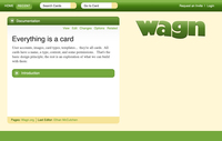
One mockup that Paul Bloch has tried out for us (click on the image to see it full size):
What do you think?
I like the boldness--and it feels like a card graphically. However some of the text is so big...I know on pages, for example, that this section can get huge. Also the wagn logo-like text is a bit...ummm wavy, which doesn't feel meaningful to me.
--Jean Russell (Not signed in).....Thu Jul 17 10:28:58 -0700 2008
I think the design is stronger than the existing one. However, I agree with Jean about the text size. On cards with huge amount of text, that's going to be cumbersome. The logo is great, but I would really like to see the wagon theme represented there. A wheel? Something.
--Aaron Nelson (Not signed in).....Thu Jul 17 10:31:48 -0700 2008
I really like the direction this is going... I love the idea of bumping up the card metaphor. I think you could push that even more and use tab, like a file cabinet, to make it all that much more cardy... I do have to say that, I live the wagon logo better than the wavy gravy letters.
--drew Bernard (Not signed in).....Thu Jul 17 10:38:18 -0700 2008
Agreed with the previous commments. I like the colors and the use. The idea of leveraging the wheel is good too.
--Fernanda (Not signed in).....Thu Jul 17 10:43:57 -0700 2008
I like that the disclosure triangles are more tightly coupled to the headings / cards they control.
Overall it's a step in the right direction. Clearly some elements need to be scaled down in size or contrast, but that's to be expected at this stage in any design.
Thanks for sharing it.
--Brian Kerr (Not signed in).....Thu Jul 17 11:26:15 -0700 2008
That certainly looks better. I always felt that the header bar should be larger and the content more readable. I have been tempted to ask Theresa to take a look as well, though she is a tad busy.
--Grant Kruger.....Fri Jul 18 08:46:47 -0700 2008
Wow - Thanks all for the input!
I'd actually like larger default text than the current design (which i often bump up once to make it easier on my eyes), but very much agree that there's a balance there with still wanting to be able to see a lot in one screen. Hadn't noticed the tighter card name/controls coupling, definitely a plus to me too. And of course we need a wagon in the logo back :-). I would also like to see something different from the typical "Web 2.0" shading look - break the borders by including design elements that look like they go off the edge of the page? Make the cards look even more like cards by having a corner curl up off the page?
--John Abbe.....Fri Jul 18 09:00:47 -0700 2008
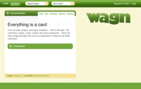
I edited the mockup to move the tabs up in the cardy way i imagined from what drew said.
--John Abbe.....Fri Jul 18 09:25:03 -0700 2008
Also, there's some interest in having more information in the card footer. Too much to have it all visible at once, so some design thought about how to do that would be cool.
--John Abbe.....Thu Jul 24 10:58:09 -0700 2008
Clear graphics, black and white is strong. The wagon aspect is well done. I always think of WagN as a verb...wagging, and that isn't there. Your logo will is so important, it's good to find the one that is "yes!".
Lovely talking to you.
Judith Osborn
--Judith Osborn (Not signed in).....Sat Jul 26 14:00:03 -0700 2008
Thanks for all the awesome feedback, everyone!
I've been working on some local css on Hooze.org that moves us in the direction of some of Paul's improvements. check it out.
--Ethan McCutchen.....Tue Aug 26 17:42:41 -0700 2008
My first thoughts are I really miss your 3 minute made logo. I really liked the wagon wheel as far as seeing why wagn is called wagn.
I like that it's simple, and clean. but I'm missing your sidebar. I feel like simplicity has been traded for a better feeling of what it does... And, I think this can be modified to do that.
I'm not sure how many designers you have on wagn, but have you put out there that you're looking for skins? I think it would be really cool to get people to design a bunch of them and then have the community choose several that are used/can be used by those running wagn...
--Adele Wilson-Hamaker (Not signed in).....Tue Sep 02 09:14:15 -0700 2008
(Not a reply to the garphics above.) The look of the new submenus in the Edit tab (which will probably start appearing on other tabs too) and the look of the View/Edit/etc. tabs themselves should be more tied-together.
--John Abbe.....Mon Sep 08 13:41:52 -0700 2008
this is a comment (sorry, i am new to this wagn business)
--David Reber.....Mon Oct 20 16:50:11 -0700 2008
Great feedback everyone! We've tried out some changes — visible now at Hooze.org — and would love to hear more thoughts about our progress on some of these visual ideas. Please add your comments here:
This really rocks. I want it already on my own Wagn. Three tweaks that imho would make it even better: lighten the icons so that they're not so close in darkness to the background (they're so close now that it actually draws my attention annoyingly), move the icons up a bit so that they're vertically centered against the background, and narrow the dark header a bit (probly requiring making the icons a little smaller), so that it's the same height whether a card is open or closed.
--John Abbe.....Fri Sep 19 15:22:07 -0700 2008
like the lightening idea. the vertical centering doesn't seem worth much grief to me, but I'll play with it.
I actually like the header being a little bigger when it's open (though I did reduce the difference for you. Interested to know what anybody else thinks...
--Ethan McCutchen.....Fri Sep 19 15:50:53 -0700 2008

Love the tab highlighting! Can you get rid of the horizontal line between the tab and the card content?
--John Abbe.....Fri Sep 26 14:21:14 -0700 2008
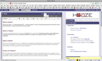
Mocked up an submenu integration mockup, with added space (5 pixels) between View, Edit, etc. and the submenu color and layout more consistent. Not enough (maybe italics isn't the way to go to show the selected submenu item - some kind of reverse video ). Note that the dark gray also extends all the way around the TinyMCE interface.
And (duh!) - the main card of the page (e.g."Hooze" in this example) doesn't need the arrow to make it the main card, does it? I think removing it may even kind of help suggest/remind people that the arrow exists on other cards to get it put in this "place of honor". In addition to the value whenever we manage to take something away...
--John Abbe.....Thu Oct 02 01:07:05 -0700 2008


