Wagn screenshots
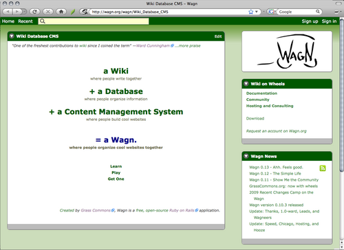
A home page
Here's the Wagn.org home page. Naturally, this site is built with the Wagn software. You can see several "cards" on the page with green headers. Everything in Wagn is organized into cards.
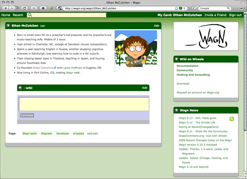
A User card
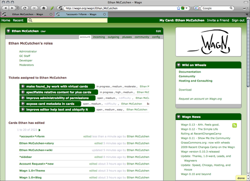
You can make user cards look however you like. This is how they look on Wagn.org. Notice how all the subsections are cards themselves, and there is a wiki area set up to be commentable.
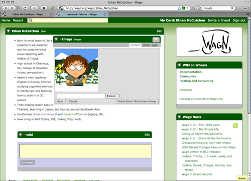
Editing one card
Double-clicking on the image gives you this interface to edit the image card. The same applies to most content on a Wagn website.
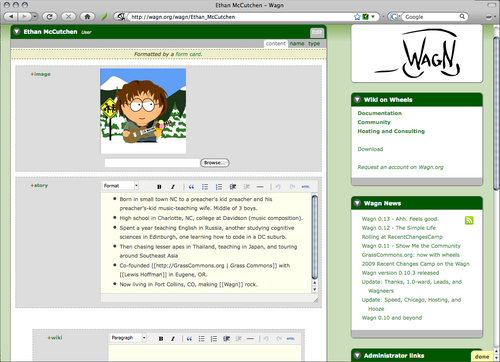
Editing several cards at once
Clicking on the Edit tab lets you edit many parts of the card at once, as part of a form.
Related tab
Wagn let's you make custom related tabs. This user tab shows information about Ethan's use of Wagn. Notice all the different ways cards can be displayed (open, closed, content-only, links, changes, etc). The "Tickets" are another type of card we created on Wagn.org using Wagn to help manage our software development process.
Default look
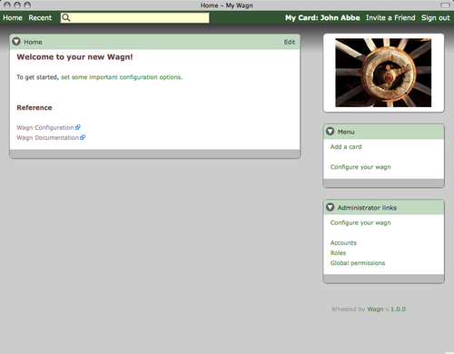
It's easy to customize the look and feel of Wagn. This skin is the default for all new Wagns — here's the home page you see when you start up a new Wagn:
Configuration options
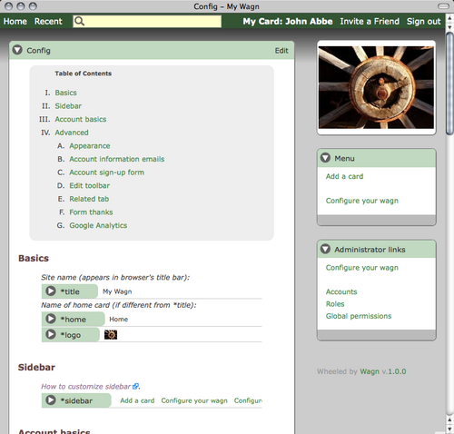
You configure Wagn just like you do everything else; by editing cards:
