style card views
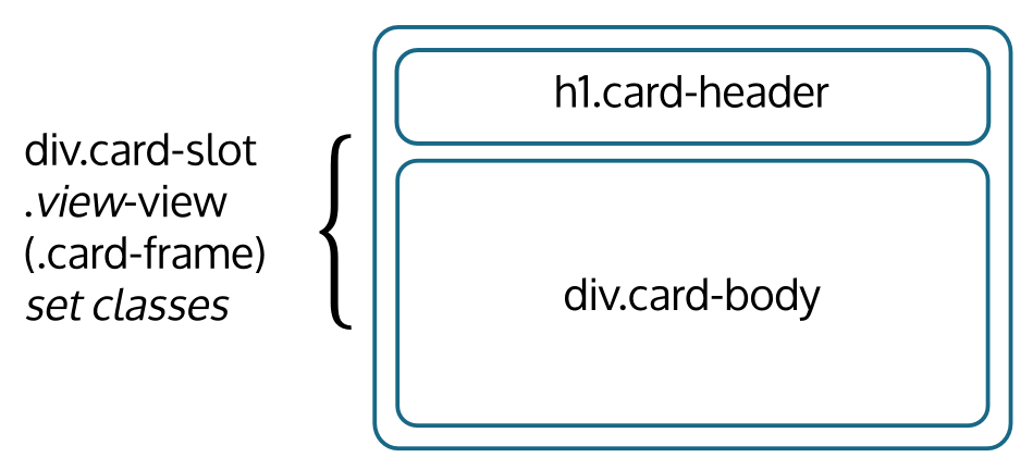
It's generally hard to do much with CSS without understanding the HTML you're trying to style. Here's an template shared by many card views:
For example, here's what the relevant HTML might look like for the "open" view of a card named "Menu".
<div class="card-slot open-view card-frame ALL TYPE-basic SELF-menu">
  <h1 class="card-header">...</h1>
  <div class="card-body card-content ALL TYPE-basic SELF-menu">...</div>
</div>
Several key points warrant special attention:
- The card-slot class is used by javascript to make the card dynamic. It's generally not intended for use in CSS styling.
- The presence of the card-frame class creates a "framed" view. Framed views are intended to be visually delineated so you can easily tell where the card begins and ends. This is in contrast, for example, with the titled view, which is intended to blend in with the content that surrounds it.
- The card-content class is used only in views in which the card-body contains only the card's actual content, like open, closed, titled, and labeled. In other views, like account, denial,
- The classes that begin in all-caps (ALL, TYPE-basic, SELF-menu) represent the card's sets. Sets are central to organizing information on Wagn; if you haven't yet encountered them, you should start with the set documentation. CSS classes for card sets follow this pattern: [set pattern in all-caps]-[anchor's key]
watch out for nesting
Wagn strongly features nesting (eg, cards including cards). HTML/CSS, too, does lots of nesting. So be mindful of their interaction. For example, consider this CSS:
.open-view .card-content { font-weight: bold } #BOO!
On the face of it, this just looks like it's meant to make the content of cards in open view display as bold, and so it will. But it won't stop there; it will also apply to the content of any card included by a card in open view. This over-application pattern is very common in Wagn. Consider the following alternative:
.open-view > .card-content { font-weight: bold } #OK!
That extra ">" is important. It means this CSS rule should apply only to the .card-content that's a direct child of the open-view. Similarly, consider the following:
.SELF-menu { color: red } #BOO!
This is a common mistake. Usually it is intended to style only the content of the card named "Menu", but instead CSS rules of this kind can impact the header, help text, menu items, error messages, etc. If the intent is to style the content, then content should always be specified:
.SELF-menu.card-content { color: red } #OK!
Note that there is no space between ".SELF-menu" and ".card-content". This notation means: all tags with both the class "SELF-menu" and "card-content".
We might summarize the ideas as "no CSS rules on naked sets". Whenever you make a rule on a set without either a ">" or an additional class, you're at risk of over-application.
