Ticket
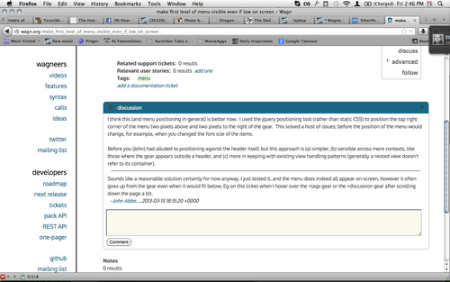
I think this (and menu positioning in general) is better now. I used the jquery positioning tool (rather than static CSS) to position the top right corner of the menu two pixels above and two pixels to the right of the gear. This solved a host of issues; before the position of the menu would change, for example, when you changed the font size of the items.
Before you (John) had alluded to positioning against the header itself, but this approach is (a) simpler, (b) sensible across more contexts, like those where the gear appears outside a header, and (c) more in keeping with existing view handling patterns (generally a nested view doesn't refer to its container).
Sounds like a reasonable solution certainly for now anyway. I just tested it, and the menu does indeed all appear on-screen, however it often goes up from the gear even when it would fit below. Eg on this ticket when I hover over the +tags gear or the +discussion gear after scrolling down the page a bit.
--John Abbe.....2013-03-15 18:15:20 +0000
From hovering over the +tags menu:

--John Abbe.....2013-03-16 01:26:15 +0000
oh, I think the issue there is that the original positioning isn't altered after the first use. will look into it...
--Ethan McCutchen.....2013-03-20 20:31:52 +0000
seems much better now. good catch.
to test, you open a menu in a position from which it should open upwards, close it, scroll the page a bit to where it should open downwards, and open it again. or vice versa. works for me. (just had to reposition it every time).
--Ethan McCutchen.....2013-03-22 17:44:37 +0000